Solving Kids' Cancer UK rebrands
As part of our commitment to drive real change for families facing neuroblastoma, we have been working hard to give the charity a new look and website. We are confident this will help us move our work forward and reach new people and supporters.
We have had invaluable input from families, partners, trustees and members of the Solving Kids’ Cancer UK team to help shape our new direction and we are excited to share this with you.
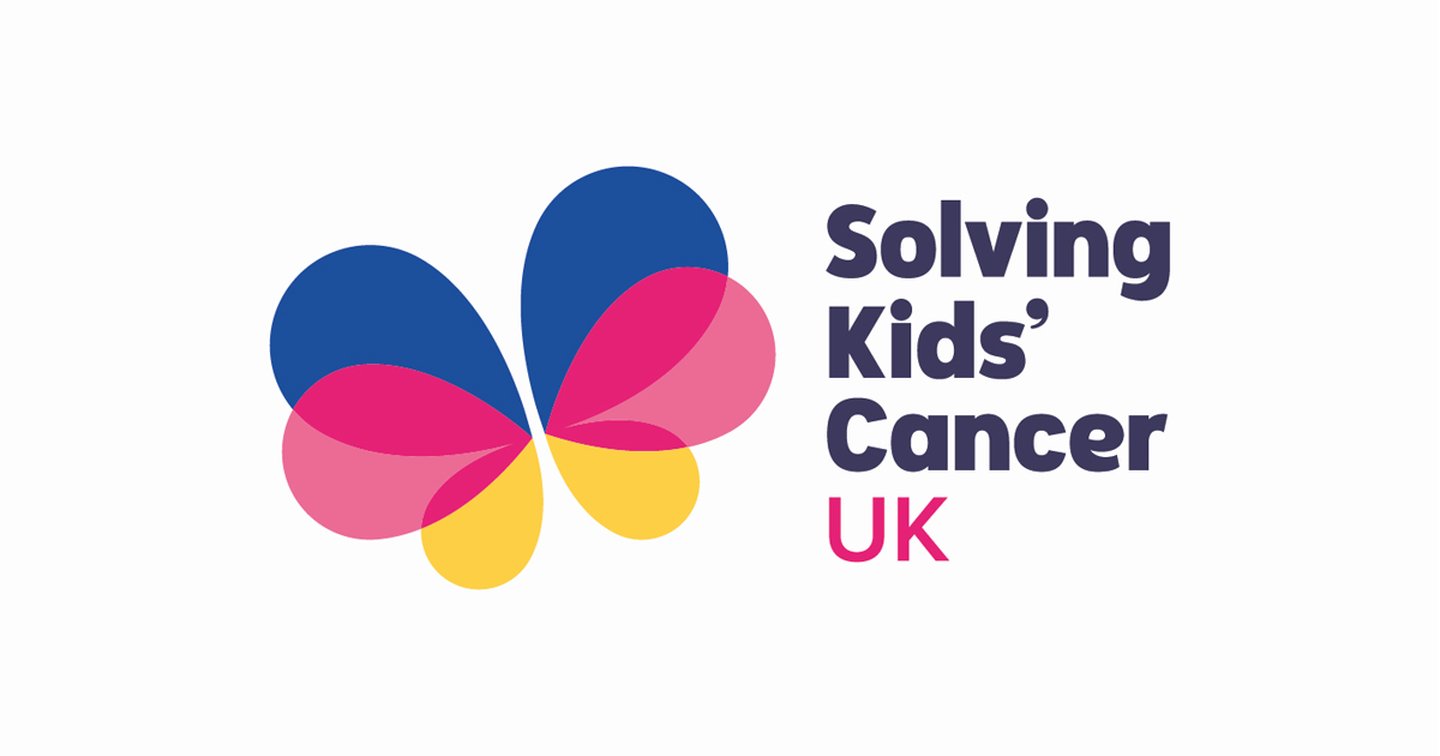
The three colours incorporated into the new design of the Solving Kids’ Cancer UK butterfly represent the three pillars of our work; blue for the pioneering clinical research in which we invest, pink for the support we provide to families throughout their cancer journey, and yellow for our advocacy for children and their families affected by childhood cancer.
Our rebrand has four key objectives:
- To clearly identify and present our work, support our five-year strategic plan and differentiate us from our sister charity, Solving Kids’ Cancer in the US;
- To help articulate and strive for better outcomes for children who are affected by neuroblastoma, both now and in the future, by driving and investing in pioneering clinical research;
- To reflect our commitment and passion to support families at every step of their cancer journey. Children and their families remain at the heart of all that we do. This will never change;
- To create an identity that is inclusive, impactful and a symbol of hope, as we continue to advocate for children and families affected by neuroblastoma.
We will not stop until children with neuroblastome, in the UK and beyond have access to the treatment they need as close to home as possible.
Improvements to the website include changes to how the site is structured so that the user can find what they’re looking for quickly and efficiently and new sections such as stories of hope.
Please do take a look around and see what you think. We hope you like it!